By Sally Jones
May 25, 2022
When you’re shopping for a home, it’s easy to get distracted by the shiny fixtures and fancy appliances. But there’s something far more important and not always easy to pinpoint that you should be looking out for: signs of good home design.
“When looking for a new home, put finishes aside,” suggests Jenna Schumacher, a principal designer at Insert Design. “Don’t let beautiful finishes overshadow space that just doesn’t work.”
So how can you tell if a house is well-designed? A well-designed home makes you feel good when you walk in. It’s well-lit, with lots of natural light and glimpses of nature viewed through ample windows and doors. Where a poorly designed home might feel cramped and cluttered—despite the best efforts of the homeowner—a well-designed home has a place for everything.
Rooms flow naturally into one another, in a way that makes sense for the way the homeowners live.
Experts call this good “flow,” and they know it when they see it. But to the average homebuyer, it can be a tough thing to spot at first glance. And poor flow is an expensive—sometimes near-impossible—thing to fix.
To help you think about the floor plan first, we asked some designers and other experts to give us some red flags of poor home design. Look for the following giveaways next time you’re touring homes.
1. The front door opens onto a wall
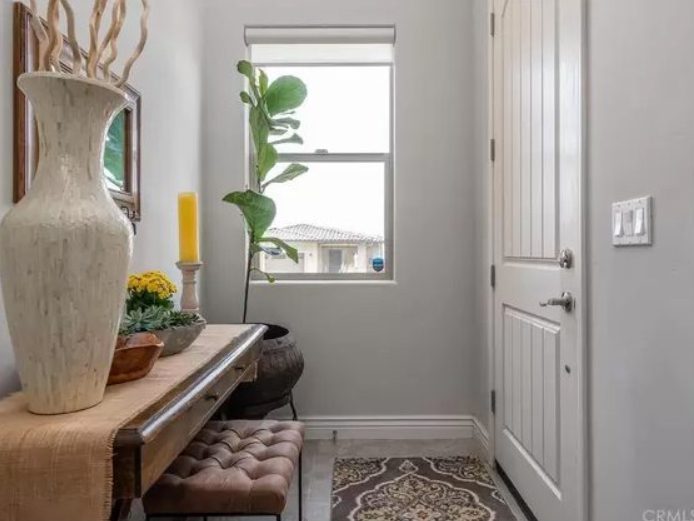
When you open the front door and you’re immediately confronted by a wall, it can make your very first moments in a home feel cramped and claustrophobic. Even if you walk a few strides and turn to see an opening to a bigger space nearby, that oppressive aura sticks with you.
“When you first enter a home, it’s nice to have a view—even if peripheral or somewhat obscured—of the rest of the house,” says Jennie Berger, co-owner of Property People. “The entryway should give you glimpses into what else is there—make you want to come in, see more, and stay awhile.”
Some front doors open directly to face a coat closet. A better design would be to place the coat closet off to one side.
“The entryway should offer some type of storage for offloading coats, shoes, bags, but not at the expense of welcoming you into the house,” says Berger.
2. The front door faces the stairs
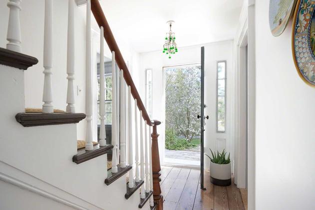
When you open the front door and are immediately confronted with a flight of stairs, it’s disorienting. You took an action and arrived at a place, and before you can even get your bearings, you’re being led away to another place. What gives?
“An entry that opens directly to stairs feels like work,” says Berger. “Like, I’ve just come home from a long, exhausting day at work … and the last thing I want is to have to trudge up these stairs.”
It’s also a big feng shui no-no. A staircase in front of the door is a pathway for the home’s good energy (and good fortune) to flow right out the door.
“Sometimes we have the ability to turn the last couple steps of the stairs and create a larger foyer area,” says Elena Caulfield, architect and construction project coordinator at Curbio. “Or we might look at whether there is an opportunity to relocate the front door to an adjacent window opening where we can redefine the entry.”
3. There are unnecessarily long hallways

Long hallways contribute to the square footage that you, the homebuyer, are purchasing, but they don’t offer you utility for your money. Consider whether your long hallway is helping the flow, or hindering it.
Caulfield says to ask yourself: “Are there closets along that hallway that can be relocated to redefine the circulation?”
Sometimes long hallways are inevitable, depending on the lot, says Berger. “We build on lots in Chicago that are long and narrow. We recommend adding windows, shelving, or additional storage and closets to make the best use of the space.”
4. The guest bathroom is right at the entrance

Another entryway no-no is to have a powder room right near the front door. Why? Because you don’t want the first impression on your guests to be a toilet.
“Many of the challenges in design we see daily involve bathrooms,” says Caulfield. “We can sometimes quite simply rotate the orientation of a toilet and add a low partition wall for more privacy.”
Other awkward places for a guest bathroom include off an eating area or through a bedroom.
5. The first view of the bathroom is the toilet

The second rule of good bathroom design also has to do with toilet placement. You don’t want the fixture to be the first thing you see from down the hall as you approach the bathroom.
“We always try to avoid this,” says Berger. “Not only is the toilet the least appealing fixture in a bathroom, but it’s also the one that requires the most privacy. Tuck it in the corner, behind a door or a wall, off to the side, or in its own water-closet space.”
If you can’t put the toilet in its own “closet,” consider hiring a professional to move the doorway, she says.
In the very best designs, the first thing you will see when you approach the bathroom is a beautiful vanity with a decorative mirror above it or some gorgeous tile work or millwork.
6. The living room is a dead end
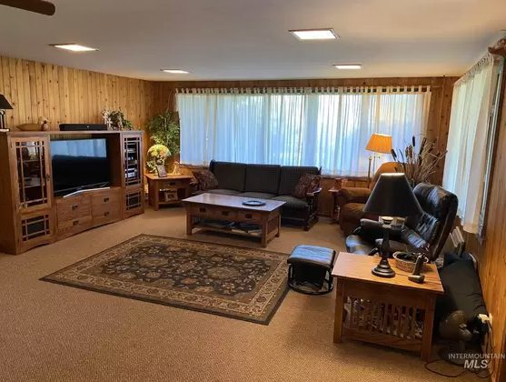
When the living room is one of the first rooms you see off the entryway, it’s best if that room features other doorways—either into another room or out to the backyard.
The reason: When the first room you enter is a dead end, groups of people will congregate there, while others who took another path are far away in the kitchen and dining areas. This is a common problem caused by poor flow.
“We solve the issue of dead-end rooms by eliminating walls and creating larger adjacent combined spaces,” says Caulfield. “If the walls are load-bearing, we provide new beams to create cased openings that enhance the flow of the spaces.”
A living room that shows broad views into other rooms or to the outdoors leaves an impression of spaciousness.
7. There are adjoining bedrooms (aka shotgun bedrooms)
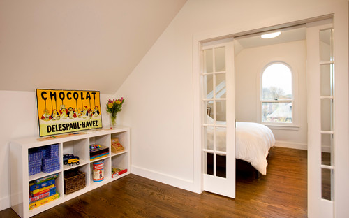
Look out for the listing that boasts three bedrooms—that actually require you to walk through one to get to another. This is a configuration that’s very common in urban construction of the 1800s, when space was at a premium and there were not a lot of construction regulations in place.
Some call it “railroad” and others call it “shotgun,” depending on where you’re from. Whatever you call it, it’s an awkward layout for the way people live today.
It’s not easy to reconfigure adjoining bedrooms—or someone would have done it already! That doesn’t mean it’s impossible. A good architect and contractor can help you make the best use of the space, though that’s not inexpensive.
The best uses for connecting bedrooms is to turn one into a dressing room, office space, sitting room, or walk-in closet. Of course, now you’ve lost a bedroom and that might decrease the value of the home. This begs a question for the homebuyer: Are you paying for a bedroom that’s not a bedroom?
Source- https://www.realtor.com/advice/buy/signs-of-a-badly-designed-house/


